Email layout
New feature for version 3.1
You can create HTML template for emails which sends from app. Go to "Configuration / Email Options / Email layout" and turn HTML layout ON.
Use tag ${body} to insert message content in html.
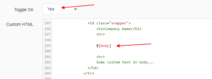
You can use code bellow as baseline for your html email. Your email will look like this:
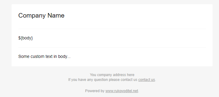
For more information about Responsive HTML Email see https://github.com/leemunroe/responsive-html-email-template
<!doctype html>
<html>
<head>
<meta name="viewport" content="width=device-width, initial-scale=1.0"/>
<meta http-equiv="Content-Type" content="text/html; charset=UTF-8" />
<title></title>
<style>
/* -------------------------------------
GLOBAL RESETS
------------------------------------- */
/*All the styling goes here*/
img {
border: none;
-ms-interpolation-mode: bicubic;
max-width: 100%;
}
body {
background-color: #f6f6f6;
font-family: sans-serif;
-webkit-font-smoothing: antialiased;
font-size: 14px;
line-height: 1.4;
margin: 0;
padding: 0;
-ms-text-size-adjust: 100%;
-webkit-text-size-adjust: 100%;
}
table {
border-collapse: separate;
mso-table-lspace: 0pt;
mso-table-rspace: 0pt;
width: 100%;
}
table td, table th {
font-family: sans-serif;
font-size: 14px;
vertical-align: top;
text-align:left;
}
.table-item-details td, .table-item-details th{
border-bottom: 1px solid #f6f6f6;
}
/* -------------------------------------
BODY & CONTAINER
------------------------------------- */
.body {
background-color: #f6f6f6;
width: 100%;
}
/* Set a max-width, and make it display as block so it will automatically stretch to that width, but will also shrink down on a phone or something */
.container {
display: block;
margin: 0 auto !important;
/* makes it centered */
max-width: 680px;
padding: 10px;
width: 680px;
}
/* This should also be a block element, so that it will fill 100% of the .container */
.content {
box-sizing: border-box;
display: block;
margin: 0 auto;
max-width: 680px;
padding: 10px;
}
/* -------------------------------------
HEADER, FOOTER, MAIN
------------------------------------- */
.main {
background: #ffffff;
border-radius: 3px;
width: 100%;
}
.wrapper {
box-sizing: border-box;
padding: 20px;
}
.content-block {
padding-bottom: 10px;
padding-top: 10px;
}
.footer {
clear: both;
margin-top: 10px;
text-align: center;
width: 100%;
}
.footer td,
.footer p,
.footer span,
.footer a {
color: #999999;
font-size: 12px;
text-align: center;
}
/* -------------------------------------
TYPOGRAPHY
------------------------------------- */
h1,
h2,
h3,
h4 {
color: #000000;
font-family: sans-serif;
font-weight: 400;
line-height: 1.4;
margin: 0;
margin-bottom: 30px;
}
h1 {
font-size: 35px;
font-weight: 300;
text-align: center;
text-transform: capitalize;
}
a {
color: #3498db;
text-decoration: underline;
}
hr {
border: 0;
border-bottom: 1px solid #f6f6f6;
margin: 20px 0;
}
/* -------------------------------------
RESPONSIVE AND MOBILE FRIENDLY STYLES
------------------------------------- */
@media only screen and (max-width: 620px) {
table.body h1 {
font-size: 28px !important;
margin-bottom: 10px !important;
}
table.body p,
table.body ul,
table.body ol,
table.body td,
table.body span,
table.body a {
font-size: 16px !important;
}
table.body .wrapper,
table.body .article {
padding: 10px !important;
}
table.body .content {
padding: 0 !important;
}
table.body .container {
padding: 0 !important;
width: 100% !important;
}
table.body .main {
border-left-width: 0 !important;
border-radius: 0 !important;
border-right-width: 0 !important;
}
}
</style>
</head>
<body class="">
<table role="presentation" border="0" cellpadding="0" cellspacing="0" class="body">
<tr>
<td> </td>
<td class="container">
<div class="content">
<!-- START CENTERED WHITE CONTAINER -->
<table role="presentation" class="main">
<!-- START MAIN CONTENT AREA -->
<tr>
<td class="wrapper">
<h2>Company Name</h2>
<hr>
${body}
<hr>
Some custom text in body...
</td>
</tr>
<!-- END MAIN CONTENT AREA -->
</table>
<!-- END CENTERED WHITE CONTAINER -->
<!-- START FOOTER -->
<div class="footer">
<table role="presentation" border="0" cellpadding="0" cellspacing="0">
<tr>
<td class="content-block">
You company address here<br>
If you have any question please contact us <a href="https://www.rukovoditel.net/contact_us.php">contact us</a>.
</td>
</tr>
<tr>
<td class="content-block">
Powered by <a href="https://www.rukovoditel.net">www.rukovoditel.net</a>.
</td>
</tr>
</table>
</div>
<!-- END FOOTER -->
</div>
</td>
<td> </td>
</tr>
</table>
</body>
</html>